Unique infographics for every client
Numbers matter, but how you share them is how you make a lasting impression.
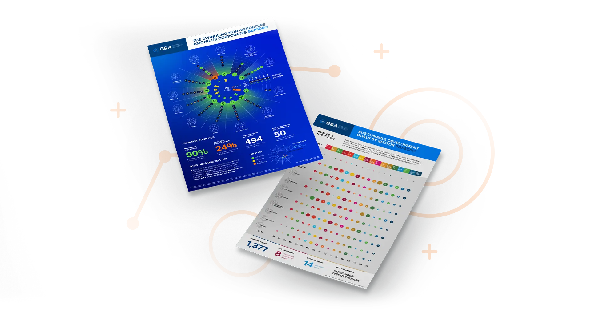
Over 20 infographic styles can be activated to fit a clients’ needs
Bubble Chart
A chart displaying multiple data points and relationships
Charticle
A news article combining text, images, and graphics
Word Cloud
A visual representation of word data
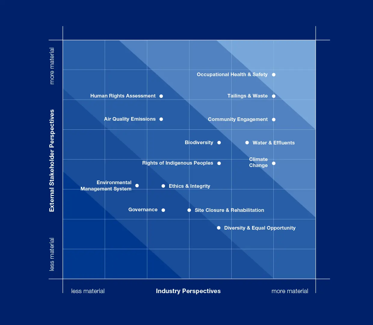
Matrix
A grid comparing and contrasting different elements
Org Chart
A visual representation of an organization’s structure
Mind Map
A diagram that organizes ideas around a central concept
Concept Map
A representation of information and their relationships
Sunburst
A chart that visualizes a hierarchical dataset
Coxcomb
A combination of a pie chart and stacked bar chart
Pie Chart
A circle graph divided into sectors
Radar
A 2D chart that displays multiple variables of data
Spiral
A spiral that often displays periodic data over time
Fan
A diagram that shows the past history of a variable over time
Synergy Map
A technique that combines information and their interactions
Decision Tree
A map of possible outcomes and consequences
Cone Tree
A 3D visualization of hierarchical data in a cone formation
Icicle Tree
A map of hierarchical data using stacked rectangles
Tree Map
A map of nested rectangles to show hierarchical data
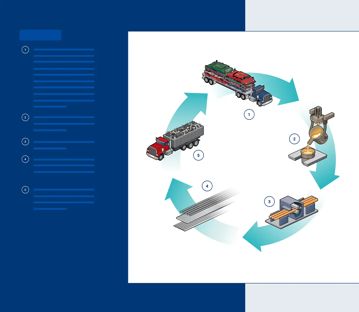
Flowchart
A diagram illustrating the steps, sequences, and decisions of a process
Illustration
A picture or diagram that helps make something clear
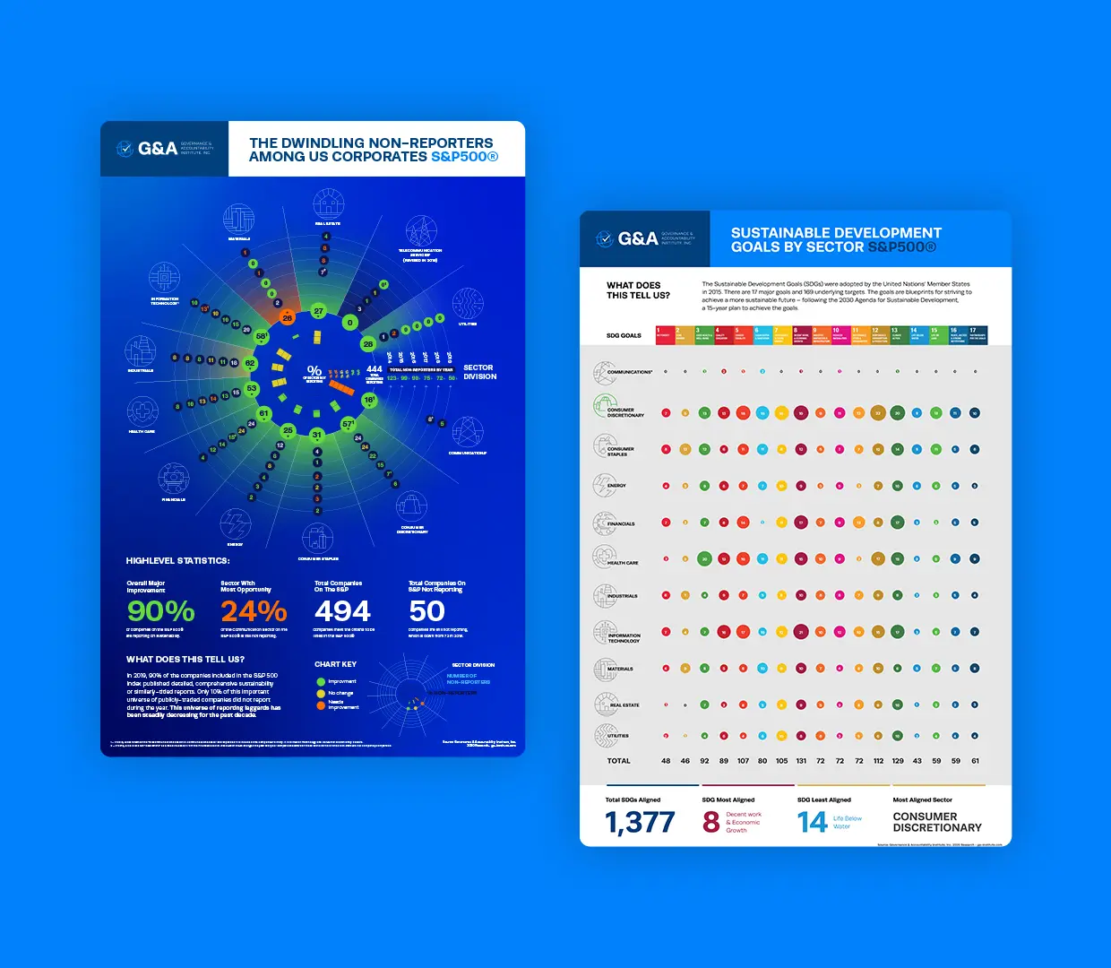
Trusted to create stunning work
Why develop an infographic?
Visually communicate your essential ESG accomplishments at a glance
Value
Enhance a variety of company materials, including ESG reports, websites, and presentations to boards or investors
Engagement
Boost legibility, memorability, and viewership with visual graphics by bridging the gap between technical data and strategic storytelling
Impact
Highlight key metrics, trends, and achievements at a glance, making ESG reports more accessible and impactful

Infographics turn sustainability data into stories. They transform complex metrics into visuals that inspire understanding, action, and accountability.
Lucas Alvarez
Senior Vice President, Creative DesignUnderstanding the Mission
Quantitative data such as emissions, energy use, water consumption, diversity metrics, and governance statistics are ideal for infographics. Visualizing targets and year-over-year progress can also help demonstrate transparency and accountability.
Absolutely. High-quality ESG infographics can be repurposed for annual reports, sustainability microsites, investor decks, and social media — extending the reach of your sustainability story and reinforcing consistent messaging.
Ideally, infographics should be updated annually alongside your ESG or sustainability report, or more frequently if new data, targets, or milestones become available.
Specialized teams understand ESG frameworks and material issues, ensuring visuals are not only attractive but also accurate, compliant, and aligned with reporting best practices.
Let's start a conversation.
Related Services
Explore what else G&A can offer

Understand what’s shaping sustainability.
Dive into blog posts that break down trends and emerging issues.
Explore the Blog